Which Fed Districts Look Most Like the U.S.?
Which of the Federal Reserve districts most resemble the overall U.S.? The Federal Reserve System is divided into 12 districts that fully cover the country. Each district has a Federal Reserve Bank, which operates independently under the supervision of the Federal Reserve Board of Governors. In this week's post, we rank districts according to how similar they are to the overall U.S. in terms of the industry composition of their GDP.
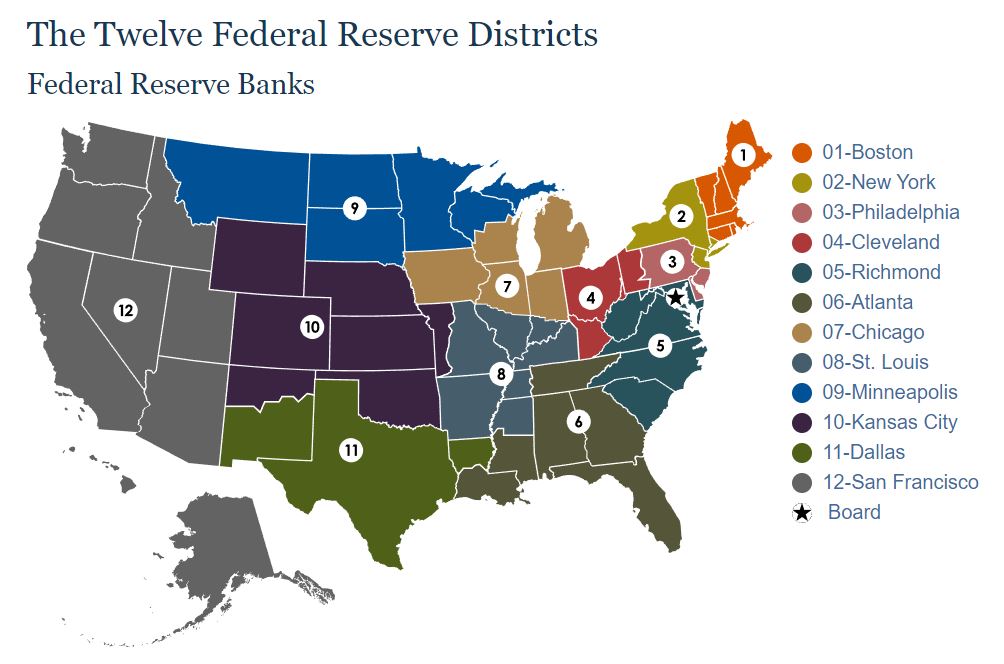
As shown in Figure 1, Fed district boundaries do not necessarily coincide with state boundaries, as they were drawn up based on economic and political conditions prevailing in 1913 when the System was formed.
To roughly approximate each district's GDP, we sum the GDPs of all states (including the District of Columbia) with territory lying within the district's boundaries. We do this at the state level and industry level.
Because district boundaries do not line up with state boundaries, some states are double counted. For example, most of West Virginia falls within the Richmond Fed's district, but the northern panhandle falls in the Cleveland Fed's district. Thus, West Virginia's state GDP is counted for both the Cleveland Fed and the Richmond Fed in our analysis. Data on GDP by industry and state are from the Bureau of Economic Analysis, which has published state-level and industry-level GDP on an annual basis since 2017.
For each industry within a Fed district, we calculate the industry's share of district GDP and compare it to the industry's share of total U.S. GDP. We calculate a measure of distance between the district's industry composition and that of the U.S. by summing the squared differences between the U.S.-level and district-level industry shares and taking the square root. We then rank districts from most to least similar to the U.S. according to this distance measure.
Table 1 compares the industry composition of the U.S. to the Fifth District, which corresponds to the Richmond Fed. Industries are sorted by the difference between their shares of the district-level and national-level economies. The table shows that the Fifth District economy is highly diversified, but its industrial composition differs from that of the country as a whole: It has relatively higher representation of the government and the professional and businesses services industries and relatively lower representation of the information, finance and insurance, and durable goods manufacturing industries.
| Industry | Share of 2022 US GDP (%) | Share of 2022 5th District GDP (%) | Difference (ppt.) |
|---|---|---|---|
| Government | 11.4% | 16.7% | 5.3 |
| Professional & Business Services | 12.9% | 15.2% | 2.3 |
| Other Services, Ex Government | 2.1% | 2.7% | 0.5 |
| Construction | 4.2% | 4.7% | 0.4 |
| Nondurable Goods | 4.8% | 4.9% | 0.1 |
| Educational Services | 1.1% | 1.2% | 0.1 |
| Utilities | 1.7% | 1.7% | 0.0 |
| Accommodation & Food Services | 3.1% | 3.0% | -0.1 |
| Real Estate, Rental & Leasing | 13.2% | 13.1% | -0.1 |
| Arts, Entertainment & Recreation | 1.1% | 0.8% | -0.2 |
| Retail Trade | 6.3% | 6.0% | -0.3 |
| Agriculture, Forestry, Fishing & Hunting | 1.1% | 0.5% | -0.5 |
| Health Care & Social Assistance | 7.2% | 6.6% | -0.6 |
| Mining | 1.8% | 0.9% | -0.9 |
| Transportation & Warehousing | 3.6% | 2.6% | -0.9 |
| Wholesale Trade | 6.0% | 5.0% | -1.0 |
| Durable Goods | 5.5% | 4.2% | -1.2 |
| Finance & Insurance | 7.5% | 6.1% | -1.4 |
| Information | 5.4% | 4.0% | -1.5 |
| Source: Author's calculations using Bureau of Economic Analysis via Haver Analytics | |||
How do other Fed districts compare to the overall U.S.? Figure 2 plots the rankings of each district from 2017 to 2022, with 1 being most similar to the overall U.S. and 12 being least similar. In 2022, the Richmond Fed's district ranked 10th in terms of similarity to the overall U.S. The figure shows that these rankings are relatively stable over time, although large economic shocks such as the pandemic recession can induce changes in the composition of economic activity that can affect the rankings.
On average, the Sixth District (corresponding to the Atlanta Fed) has been most similar to the overall U.S., while the district that has been the least similar has been the Second District (corresponding to the New York Fed).

What does the Richmond Fed's relatively low ranking in terms of similarity to the U.S. economy mean for interpreting data such as the Fifth District Surveys of Manufacturing Activity? It's important to keep in mind that the manufacturing and services surveys are surveys of private sector firms. When omitting the government sector from the analysis, the Fifth District's industrial composition looks more like the national private sector than many other Fed districts. Table 2 shows the industry breakdown of private sector output in the U.S. versus the Fifth District. The largest deviation is 3.7 percentage points, in contrast to Table 1 where the largest difference was over 5 percentage points.
| Industry | Share of 2022 US private sector GDP | Share of 2022 5th District private sector GDP | Difference (ppt.) |
|---|---|---|---|
| Professional & Business Services | 14.5% | 18.2% | 3.7 |
| Construction | 4.8% | 5.6% | 0.8 |
| Real Estate, Rental & Leasing | 14.9% | 15.7% | 0.8 |
| Other Services, Ex Government | 2.4% | 3.2% | 0.8 |
| Nondurable Goods | 5.4% | 5.9% | 0.5 |
| Utilities | 1.9% | 2.1% | 0.2 |
| Educational Services | 1.3% | 1.4% | 0.2 |
| Retail Trade | 7.1% | 7.2% | 0.1 |
| Accommodation & Food Services | 3.6% | 3.6% | 0.1 |
| Health Care & Social Assistance | 8.1% | 7.9% | -0.2 |
| Arts, Entertainment & Recreation | 1.2% | 1.0% | -0.2 |
| Agriculture, Forestry, Fishing & Hunting | 1.2% | 0.7% | -0.5 |
| Wholesale Trade | 6.8% | 6.0% | -0.7 |
| Transportation & Warehousing | 4.0% | 3.2% | -0.9 |
| Mining | 2.0% | 1.1% | -1.0 |
| Durable Goods | 6.2% | 5.1% | -1.1 |
| Finance & Insurance | 8.5% | 7.3% | -1.2 |
| Information | 6.1% | 4.7% | -1.4 |
| Source: Author's calculations using Bureau of Economic Analysis via Haver Analytics | |||
Figure 3 plots the rankings of the 12 Fed districts in terms of similarity of private sector industry composition. The Fifth District is solidly in the top half of Fed districts in terms of the similarity of the industrial makeup of the private sector to that of the overall U.S., ranking fifth in each year of the analysis. This suggests that the Richmond Fed's business activity surveys may be a reasonably representative indicator of business conditions nationwide, as recently explored by my Richmond Fed colleagues Jason Kosakow and Adam Scavette.

However, even if regional Fed surveys don't match up perfectly with national surveys, they may still be of value when it comes to understanding local and district-level conditions. An article by Richmond Fed economist Santiago Pinto finds that Richmond Fed manufacturing survey responses should be weighted differently to more closely match the national Manufacturing Purchasing Managers' Index published by the Institute for Supply Management but that the index performs well in capturing regional manufacturing activity as measured by employment growth. One of the strengths of the Federal Reserve System is its ability to bring diverse views to the national monetary policymaking process, and having distinct regional perspectives is an important part of that advantage.
Views expressed in this article are those of the author and not necessarily those of the Federal Reserve Bank of Richmond or the Federal Reserve System.